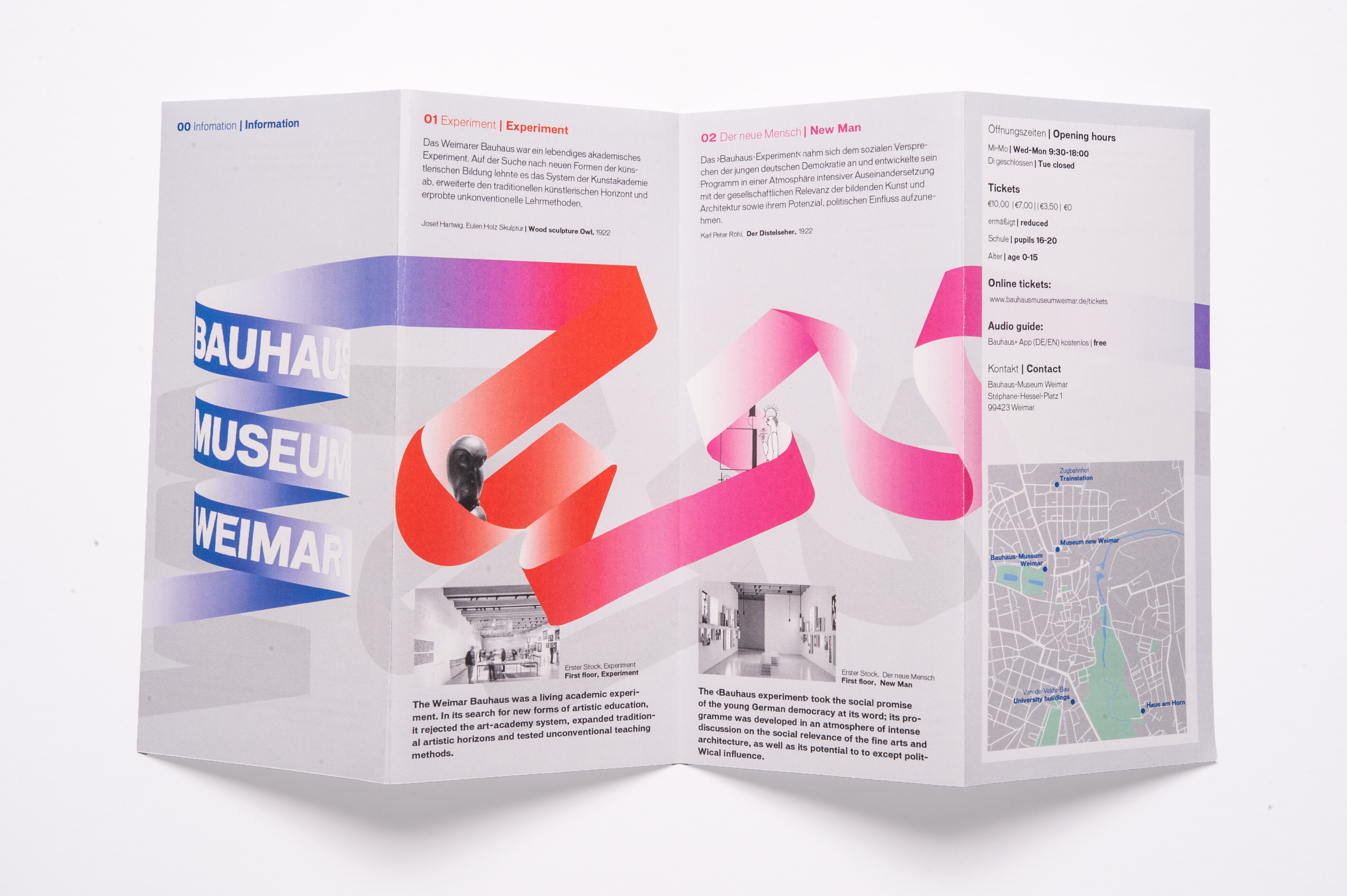
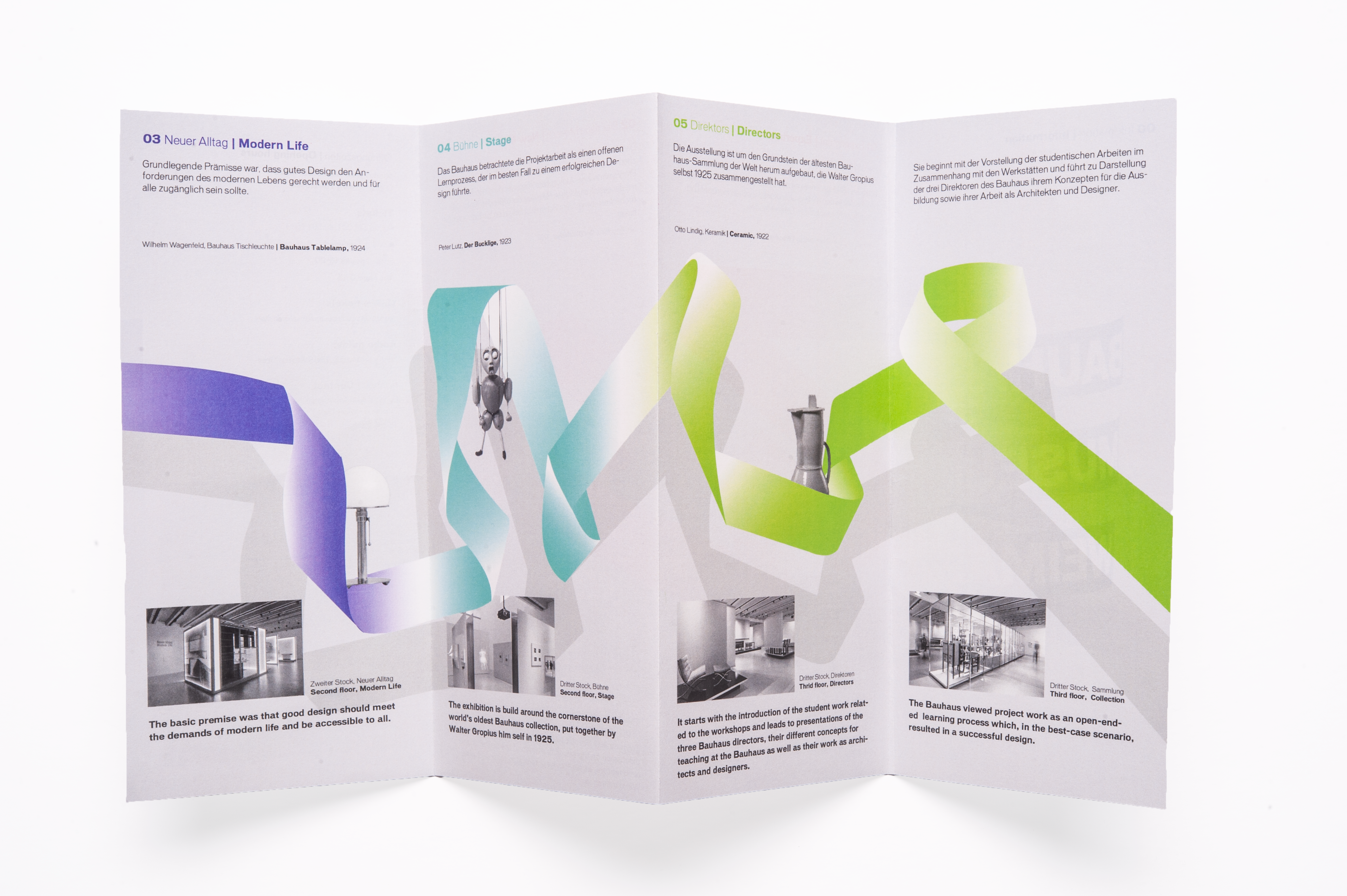
Brand Identity | B IS FOR BAUHAUS

“B is for Bauhaus” is a visual identity for the Bauhaus Museum in Weimar, which is intended to offer connoisseurs or experts the opportunity to deepen their knowledge and recognise new connections. On the other hand, it is also intended to do justice to visitors who visit the museum without much knowledge and want to learn more about the subject, or who want to gain an insight into a world they do not yet know in detail.
Issue
eimar was the birthplace of the Bauhaus, a lively school of ideas and experimental site for liberal and applied arts, design, architecture and pedagogy. However, the complexity, diversity and development of this experimental site is not readily apparent to visitors who have no or insuffi cient prior knowledge of the Bauhaus. Therefore, these visitors may not be able to understand why the exhibited objects are so different and what history or development lies behind them.
Concept
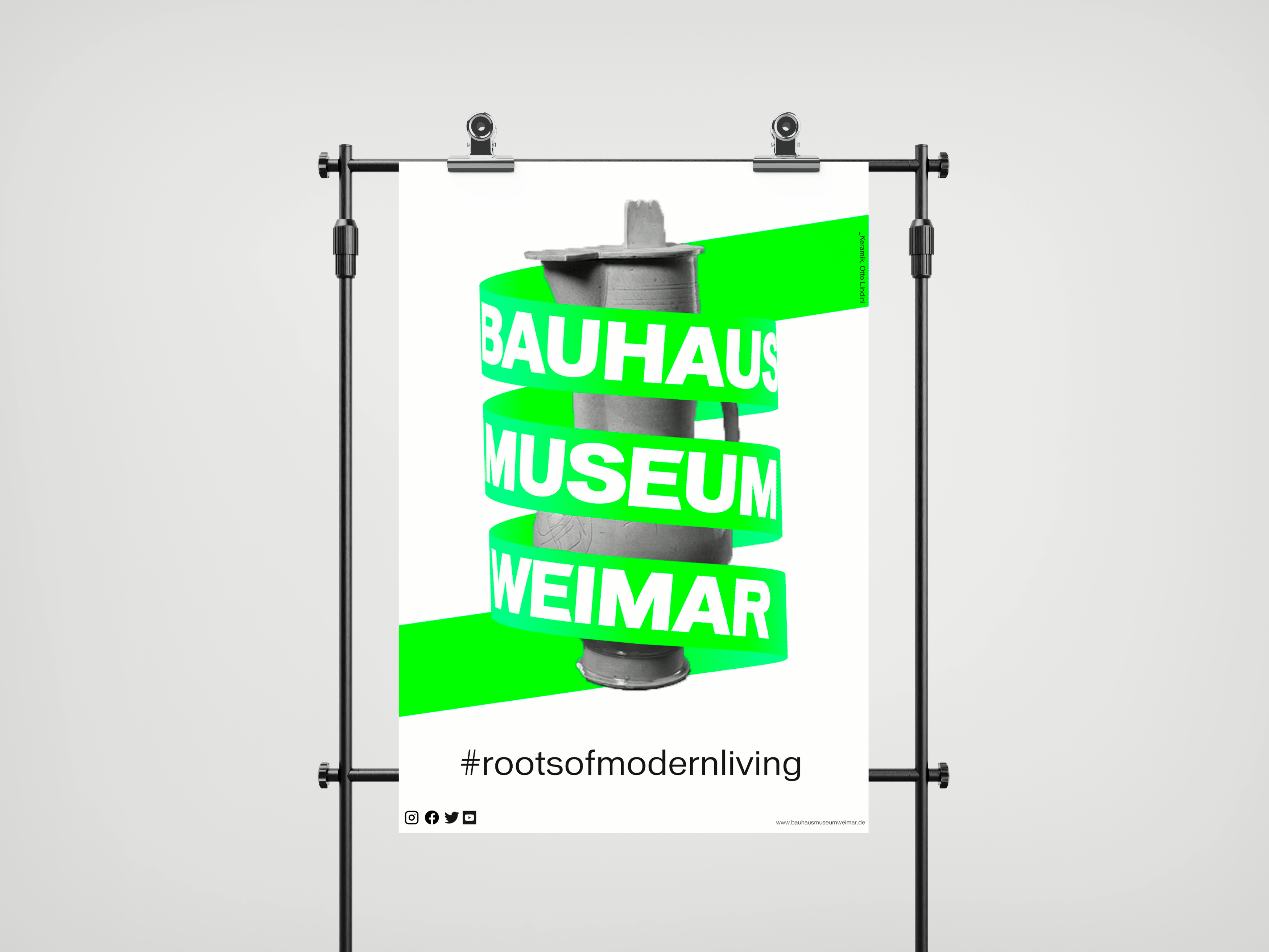
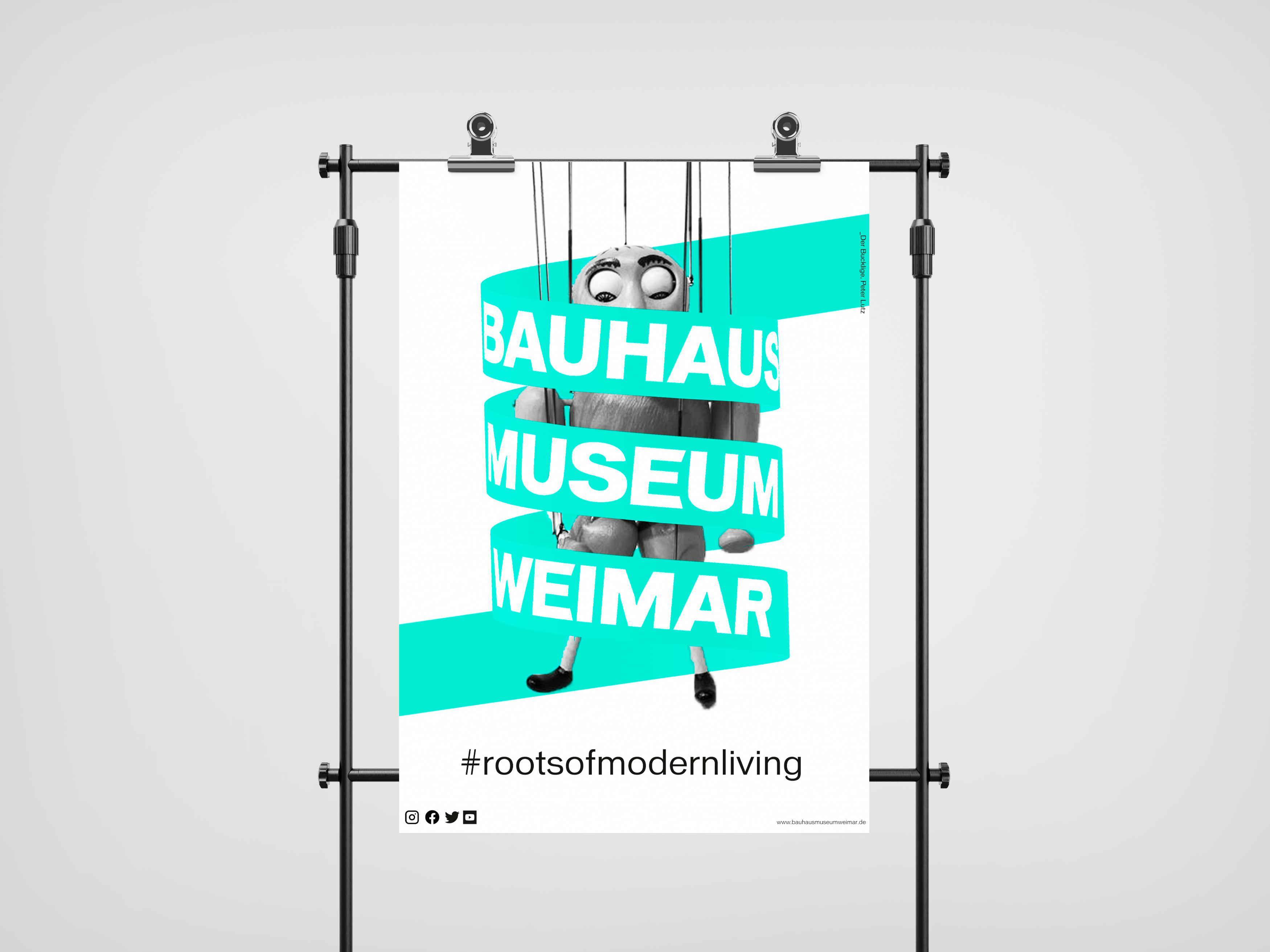
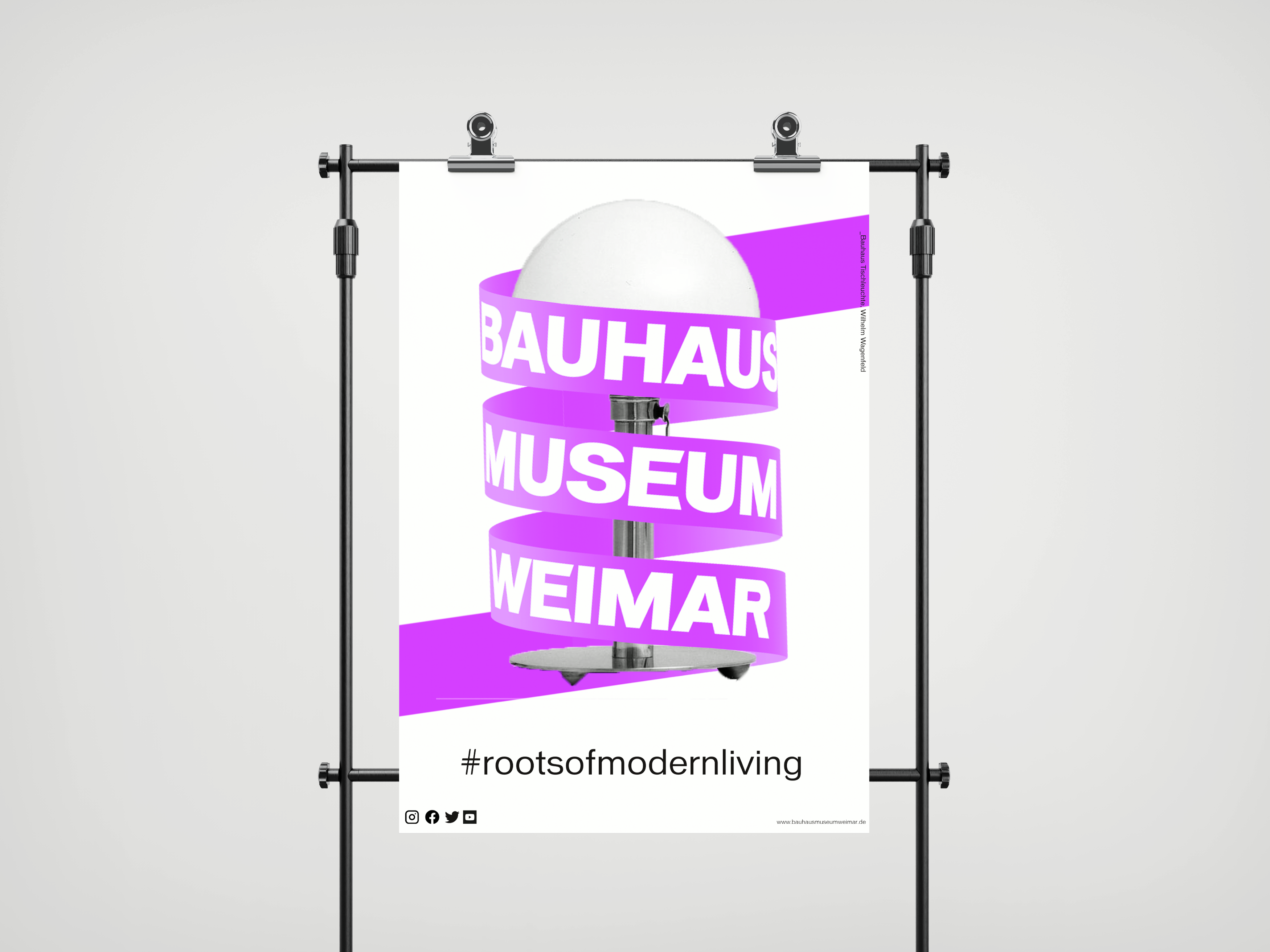
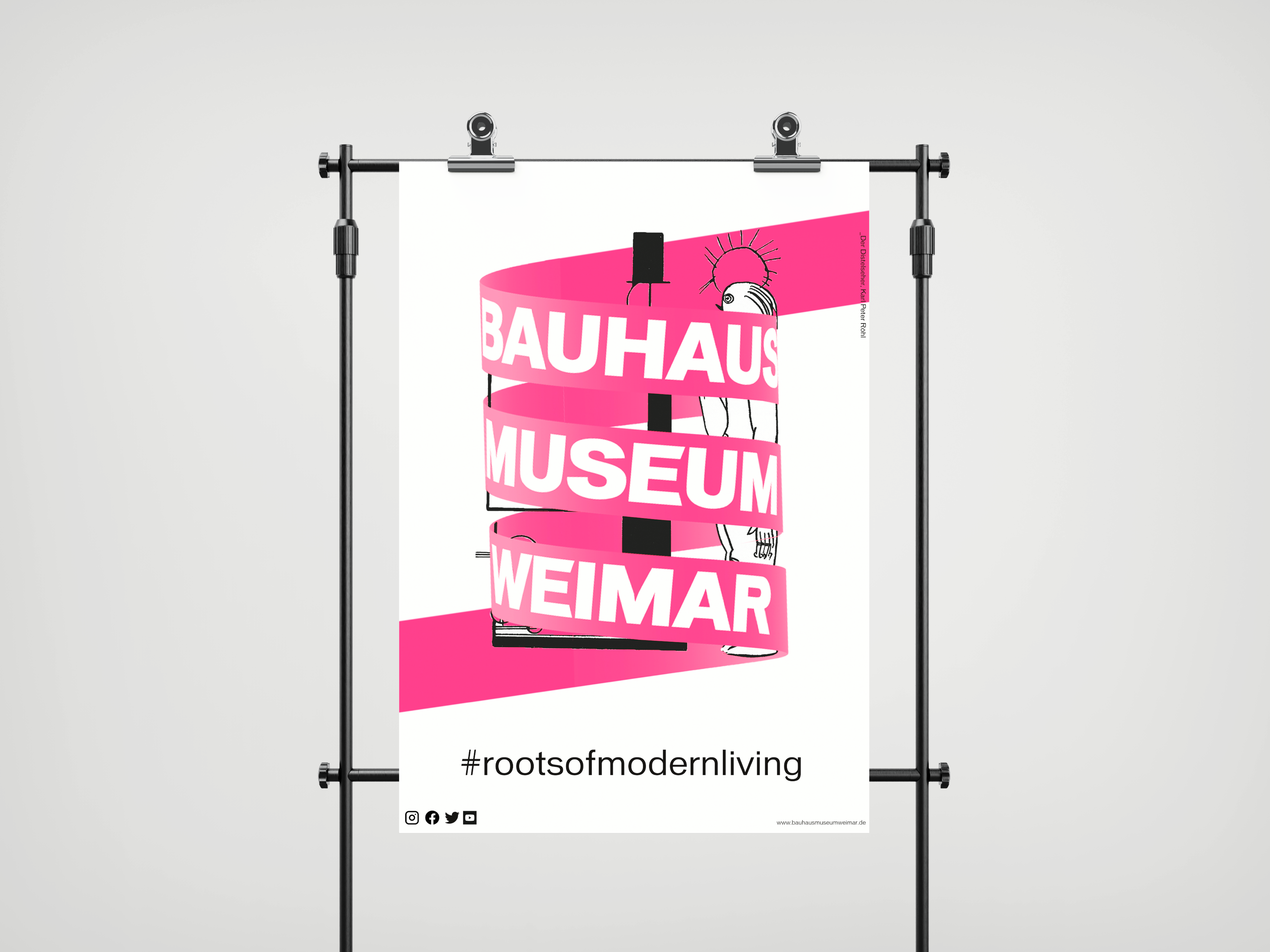
The slogan “Roots of Modern Living” is intended to highlight the beginnings of this diverse, constantly evolving school and to remind us of the important role the Bauhaus played in laying the foundation stone of modern living and how today’s developments in art, architecture and design also have their origins in this foundation stone. This constant, never-ending development also plays an important role in the concept of the visual identity of the Bauhaus Museum Weimar. Therefore, the shape of a spiral was chosen for the logo to represent this never-ending development. The spiral itself is an element that appears in many works of the Bauhaus, be it in the nature studies (France, Plants as Inventors, 1923), in Moholy Nagy’s work (painting, photography, fi lm; 1925) or in Paul Klee’s notebook “The Nature of Nature.”